Wazaaa Heita ! le 17-08-13
le 17-08-13
8ta is a mobile service launched last October by Telkom in South-Africa. When we discovered the identity we were all excited to know what was behind this 8ta number. That’s when we started to have communication issues…
8ta design idea has everything a look & feel could want: clever naming, nice and friendly typeface, a lively pink dot out of the blue, and this “ta” reminding Homer Simpson getting pissed off.
According to 8ta launch campaign, the brand name is pronounced Heita, slang for Hi in South-Africa. From a naming point of view the execution is really smart even though saying hello in the telecommunication world is not new – “Oi” in Brazil or Orange messaging using “hello” – but it surely brings something fresh on the South-African market.
8ta pleases the eye, but when it comes to language it looks like someone got confused. How do you pronounce this brand? The TV commercials, that are quite entertaining, worked on this dilemma, linking the logo with its pronunciation. But the print campaign was messier, just using the “Heita” word with this soundless pink dot in a totally different look & feel than the one on 8ta website.


Despite its visual strength, the pink dot creates confusion when it comes to typing the right web address. Pronouncing the name is also an issue when you never heard it before; even more when your products are not named the same – “8ta prepaid” and others “8.ta starter pack”.
We often hear that new brands need to be iconic; with a pink dot? Isn’t 8ta naming and potential language clever enough to make this brand iconic?
Even though using numbers for telephone brand names has long been done, as 9telecom or all the 118 numbers in France, 8ta still has some room to play with its number or slang language.
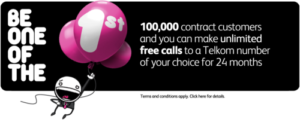
Why does the promotion campaign inviting people to “be one of the first million 8ta customers to get free minutes for life” doesn’t invite every 8th customer instead? Every 8th would become the new 1st.

I admit it’s easy to snipe something you wished you could have done, I confess. But the 8ta identity raises criticism regarding language. Not only because it could create a real nomenclature and communication based on an everyday language; but mostly because neither clients nor the general public can really play with the brand, just joking with it, making it theirs to communicate with, as slang is made to be. 8ta has everything to become the Bud “Wazaa!!” of telecommunication, so we hope they’ll make this brand more than a nice logotype, a brand people can communicate with.
